
Reading Time: 7 minutes
This is part three in a mini-series – Testing in Real Life – that aims to share practical information about testing, based on real life examples. It’s born from the observation that a lot of resources I’ve seen appear to concentrate mostly on theory, or how to advance existing experience, but there’s not a lot about how to actually do these things in real life, or get started with them. The information I’ll share in this mini-series is based on my recent experience of helping someone test their mobile app for the first time, as an example of how to test in real life.
In this post, I’ll describe some interesting bugs that I found in a seemingly boring place – an on-screen keyboard.
How often do you think about testing input methods? Be it keyboard, mouse, touch, upload, camera, or something else, input is an important part of all, if not all, software applications. Since on-screen keyboards are normally considered as part of the device (e.g., mobile, tablet, etc.) or even a separate app in its own right, they might not be something that you think to test as part of an app that utilises them. However, I’ve found on multiple occasions that it’s wise to test your app with on-screen keyboards as if it were any other part of the app you’re building. Whether you class it as integration testing or something else doesn’t really matter. What matters is that users will notice if a keyboard doesn’t function properly with your app, and any undesired behaviours could be the difference between them continuing to use your app or not.
Context
Most of the issues described in this post were discovered on the on-screen keyboard while using a mobile app. This means that features typically associated with a physical keyboard, such as tab navigation, weren’t considered, but those associated with a digital keyboard, such as customisation, were.
At the time of testing the app, there were only two places where user input via an on-screen keyboard was possible – the login / sign up screen, and a field for quantity or weight. I also found issues and had lots of ideas about how to test the login / sign up screen, but that isn’t the focus of this post. For more on that, I’ll direct you to this Ministry of Testing Club post on test ideas for a login screen.
Bugs
Without further ado, here are some of the bugs I’ve found on on-screen keyboards, and a bit on why they matter.
Password Manager Option Disappears
Pretty self-explanatory – I found that the option to use a password manager on the device wasn’t always available on the login / sign up screen.

Password managers are becoming more and more popular not only for their security benefits, but also for their convenience. If your app doesn’t (always) allow users to utilise password managers, then you’re making the experience of using your app not only inconvenient, but cumbersome.
Think of the experience for users if you’re forcing them to open another app and navigate through that to copy login details before they’re able to paste and use them to log in to yours. This is definitely something that users with password managers will notice.
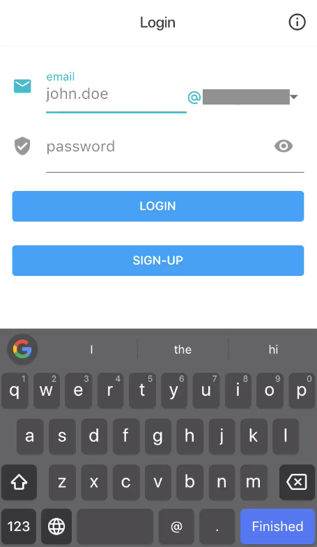
Password Manager Can’t Complete Email Field
Not only did I find that the password manager option wasn’t always available on the login / sign up screen, when it was available, only the password was completed. The password manager wasn’t given the necessary access to complete the email / username field, meaning that users would still have to manually type their email address. Again, this is inconvenient and annoying for users.
You might also notice that the screenshot above shows a dropdown menu for the email domain. I wanted to see how this would affect the password manager, and if the domain would appear twice (once in the text field again in the dropdown), but I wasn’t able to test this, since the email field wasn’t populated at all. I wonder if the two were connected and the field for the first part of the email address was coded in such a way that it didn’t seem like an email / username field at all and that’s why the password manager couldn’t access it…
Different Keyboards Displayed
The device I used for testing had custom keyboards and password managers installed as well as the system ones. With the device set to use the custom ones as default, I was surprised to find that the app only used the custom keyboard some of the time, and displayed the system keyboard other times.
The insistence on using the system keyboard is an annoyance I’ve experienced on other apps, which greatly hinders the range and ease of input, but having a mix of both within one app was new to me. Of course, users install and set custom keyboards for a reason, so your app should consistently allow these to be used throughout your app when possible.
I thought about other mobile apps and wondered if perhaps the password manager option was only hidden when the custom keyboard was shown, but it was also sometimes hidden when the system keyboard was shown. It seems that, although password managers might only be available when showing the system keyboard, these were still two separate issues.
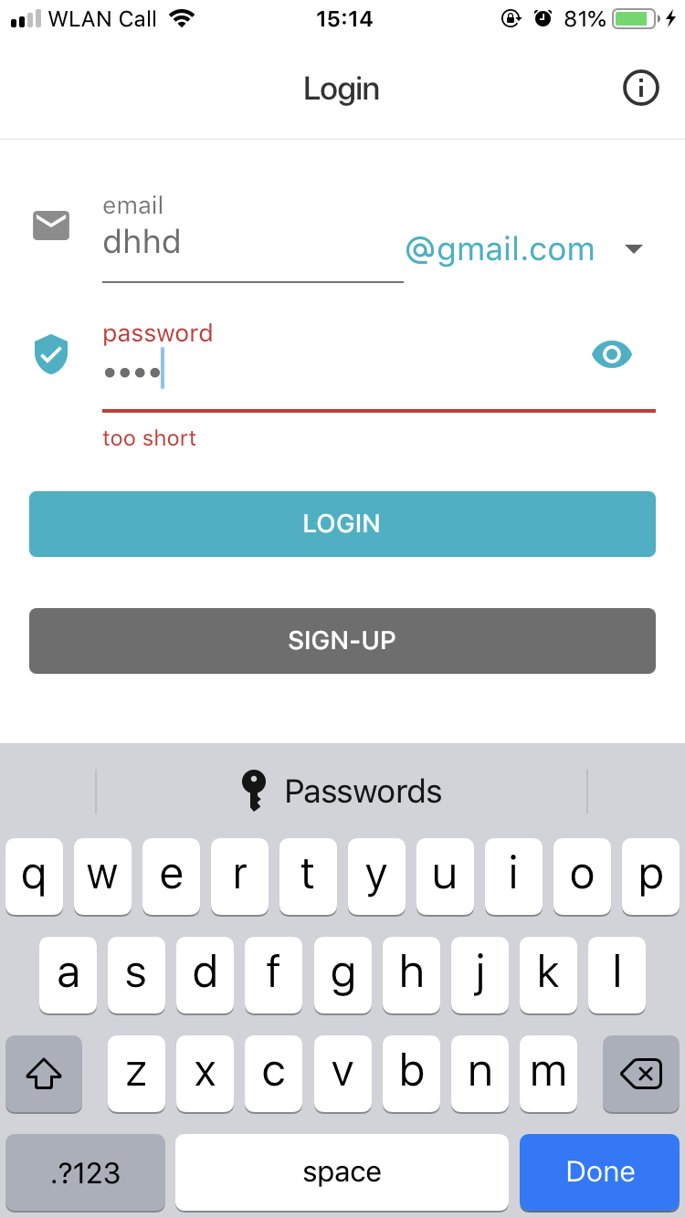
Dark Theme Only
Did you notice in the last screenshots that the keyboard went from light to dark? This isn’t something I changed on my device or within my apps between testing. Although the app being tested generally had a light theme, with a white background, it turns out that the user-selected keyboard colours had been overridden as part of a fix for another issue with the status bar content not being visible.
This is an interesting example of regression – where changing one thing for the better can have completely unintended consequences on something else. It also demonstrates how implementation methods are important for testers to know – a fact I’ve sadly had to fight for more than once. When testers know how something is implemented, we can make better decisions about how to test it, based on the implementation details, so get as much information about this as you can.
Keyboard Hard to Hide
Particularly noticeable in the screenshot below, when the keyboard was shown, there often wasn’t very much white space to click on in order to take the text field out of focus and hide the keyboard, without unintentionally clicking on something else (clicking on the header where the “Login” title is didn’t work either).
I logged this as a bug rather than an improvement because it’s not only annoying to the user, but it also makes the probability of forced errors much higher. Imagine being a frustrated user continually clicking on things by accident because you’re trying to hide the keyboard to see what’s underneath.
Incidentally, this same issue once caused me to believe there was a problem with my phone because I didn’t realise there were extra settings under the keyboard. I couldn’t scroll them into view while the keyboard was visible, and I couldn’t easily hide the keyboard either, after several attempts. My phone contract was due for renewal, so I got a new device, but I was pretty annoyed to later discover that there actually wasn’t anything wrong with my original device – the settings just needed to be adjusted, but I couldn’t see them because of the keyboard.
The improvement I suggested to fix this issue was to hide the keyboard on scrolling, which is demonstrated quite nicely in the .gif below. This scroll action also works for shorter content.
Improvements
I also found some things that weren’t bugs as such, but could be improved to offer users a better experience.
Enter Key Text
On the login / sign up screen in particular, I noticed that the text on the keyboard enter (or return) key wasn’t the most helpful or reflective of what it actually did. The original text was “Finished” or “Done”, even if there was more to do before moving on. The labels didn’t make sense in context.
When you pressed the enter key on the Email field, the cursor moved to the password field. I suggested changing the text to “Next” instead. When you pressed it on the password field, the action was the same as pressing the Login button. I suggested changing the text to “Login” instead.
This is a very minor detail, but it’s important to have text that accurately reflects the actions that will actually be taken once a button is pressed, particularly if there is no way to undo the action. This helps to prevent errors and worry or frustration.
Show Keypad for Number Fields
I mentioned earlier that there was an input field for quantity or weight. Only numbers could be entered in this field, but the full keyboard was still shown, including letters and special characters. Although only clicking on the numbers entered something into the fields, and clicking on letters and special characters had no effect, what would be better is to display a keypad with only numbers instead of presenting a full keyboard with mostly unusable characters. This also reinforces to users that only numbers are allowed, making expectations clearer.
Other Things to Consider
As well as when testing this mobile app, I also came across some interesting things to consider on a recent project with software on a physical, free-standing machine, which also used an on-screen keyboard:
- Pros and cons of using a standard keyboard library vs. a fully custom developed keyboard
- Physical location and language selection impact on keyboard layout and available characters
- Multiple language-based layouts vs. single layout in alphabetical order
- Disabling or hiding invalid characters on the keyboard vs. displaying error messages
- Testing on multiple layers vs. relying on unavailability of characters in the keyboard to avoid security issues (thanks to Ben Heinrich for helping me see sense on this one – duh!)
- And more…
The point I want to get across in this post as that even the most seemingly unremarkable, common, or simple product features could be hiding various bugs, issues, and opportunities for improvement. It’s important not to get complacent and always push yourself to think about what else you could test and what else might go wrong. In real life, even a keyboard could be the reason why people won’t use your product.
Just as there’s more to keyboards than you might have thought, there’s more to testing than finding bugs. Read the final installment of the Testing in Real Life mini-series now, which explores some of the other things testers can (and should) get involved in.
I once had to test a touchscreen keyboard. It was part of the equipment fit for a turnkey medical application that the company I was working with had written device controller software. The touchscreen keyboard was part of the specification because in the environment that the whole package was going to be used, it was essential to minimise the number of places that dirt and dust could accumulate, such as in a traditional keyboard, to prevent cross-contamination of samples.
For regulatory compliance reasons, I was testing by executing a test script (we were close to the go-live date and so this was literally just jumping through the necessary regulatory hoops rather than any sort of developmental exploratory testing). But this was also the first point at which the hardware and software had been brought together.
Executing the normal workflow actually involved some hard-coding of medical sample identifiers and inserting ID details accurately into multiple places. At this point I found something that was to me disturbing. The touchscreen keyboards did not support keyboard shortcuts, especially those for cut and paste (Ctrl-X, Ctrl-V). No-one had thought that laboratory end users would need to use the special function keys “because they aren’t tech people” (well, not in that sense). So end users would have to enter names and ID details multiple times – and you couldn’t exactly touch-type on these keyboards.
The problem was down to a mismatch between the software the devs had written and the onboard drivers that the keyboard manufacturer provided as firmware. Everyone had assumed that the kit would just work seamlessly straight out of the box. Well, so much for assumptions…